99 is the biggest Brazilian mobility company and has a broad array of products. When I joined in 2017, its primary focus was competing with Uber with a fleet of private and taxi drivers. It had passenger apps for Android and iOS, an Android app for its drivers, and a web app for its corporate clients. As the second UX designer to join the company, I touched all of these interfaces but dedicated most of my time there working on the passenger apps team. In those days, we had 150k rides per day and more than a million monthly active users. I was the only designer on this team for a while and dealt with challenges spread throughout the whole journey—from onboarding to trip review.
Challenge
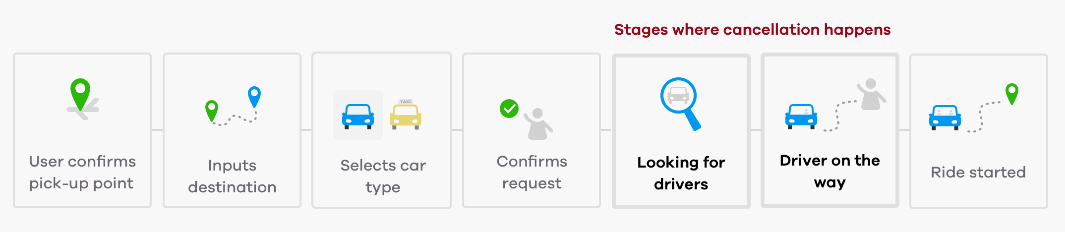
We were facing an average cancellation rate of 12% that spiked at rush hours due to the long waiting times. The user journey had two steps where a user could cancel—Finding a driver and driver on the way— and we wanted to decrease the cancellation rates on both. But the second step was a priority because, at that point, a driver had already accepted the ride. That meant that our drivers were probably already driving to the pickup point when the user canceled, often facing the traffic of big cities like Sao Paulo and Rio without any compensation.
99 didn't want to punish the passengers, so at that time, a cancellation fee was not an option. With that in mind, I started to investigate how the users perceived these fundamental flows to find their weaknesses and propose improvements to decrease the cancelation rates.
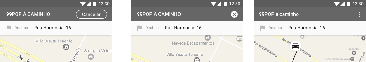
Passenger's steps on the riding journey
Process
User testing: The investigation started with a user testing of the journey from selection to ride. Together with the product manager, we decided to run a broader test because there was no budget for multiple sessions, so it was nice to also build a backlog of insights for other parts of the journey.
The session was in person, and I was responsible for writing the script and took turns with our Product Manager to interview and take notes. For the first time, five users visited us in the headquarters, and there was a fantastic collective effort to make sure we had a comfortable place and suitable equipment. It was essential to have an experience as close to reality as possible, so our developers participated as drivers, and also had the opportunity to see their product in action.
Results analysis: During the sessions, we've seen the following issues that could cause cancellations:
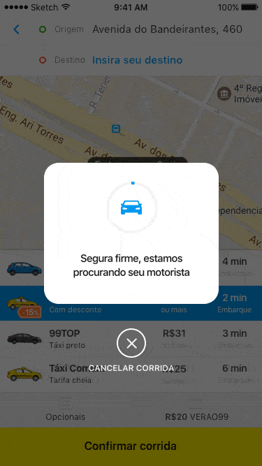
1 - The "looking for drivers" status was a modal and people would try to close it instinctively
2 - It was not clear that the driver was on the way
3 - The driver picture was too small, making it hard to check if you had the right car
4 - The cancel button was too prominent in both matching and driver on the way stages. On the other hand, the message button didn't stand out enough, so people would rather cancel than trying to contact their driver.
Solutions
The product manager and I set up a session to share the findings and brainstorm solutions with the team. Since we were focusing on cancellation, we prioritized the following main challenges:
How might we humanize the drivers and highlight their information before a passenger decides to cancel?
We've seen that people had a hard time with the small driver picture and couldn't find the message feature, so bringing this information to life could have an impact on their desire to cancel.
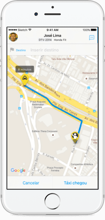
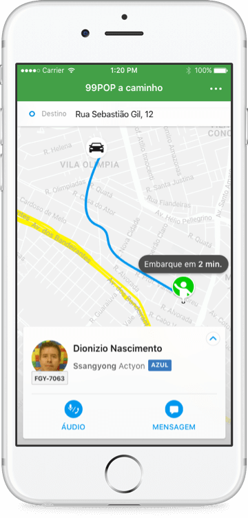
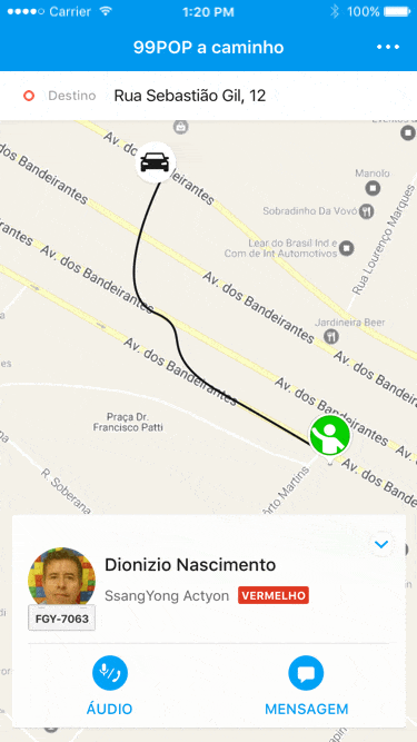
Old experience
New experience
With that in mind, I worked to bring this information to a more prominent area on the bottom of the page, emphasizing the relevant actions for the different ride status. The payment details were important too, but the passengers viewed them once to validate that their payment details were correct, so it didn't need to be a permanent component. That's why the chosen option was a bottom card that started with an expanded view showing the details but automatically closed, keeping the driver details on the spotlight.
How might we help users better identify the different trip status?
The users were not aware that the driver was on the way, or the ride had started, which impacted cancellation and complaints to customer service.
That's why, after a few iterations, I've decided to experiment using the header color and copy to display the different ride status. It was also necessary to reassure the car category a user had chosen because confusion around the car type was also a driver of cancellations.
A tougher challenge: Make canceling harder, but user friendly
The cancel action was prominent and easy to reach with your thumbs. Obviously, making canceling harder could have the most significant impact, but at first glance, it's not the most user-friendly measure. However, 99 had two types of users: the passenger and the driver. The later was heavily impacted by easy cancellation. As I mentioned before, we didn't want to have cancellation fees, so we worked on some options to make the cancel action less prominent and highlight the driver communication first.
Since this is a delicate issue, I've relied back on our users, setting up eight remote user testing sessions to validate different options.
Surprisingly, the first option, with a more explicit CTA, was the hardest to find for our users, and putting the action under a menu had a better performance.
Impact
After implementation, we've seen the following results:
Cancelations decreased by 7% when the user was waiting for us to find a driver
Cancelations decreased by 5.8% when the driver was on the way
Overall, the success rate increased
Final prototype of the design
Learnings
The changes I proposed were complex and took a long development time, and in the end, I was unsure which were the most impactful changes and how they increment to the final results. If I could go back in time, I would propose to slice the project in different steps and measure each one of them.
Thanks for reading! If you want to say hi, feel free to drop me a line at
may.vendramim@gmail.com or contact me through the social sites listed below :)